With 2024 dominated by sleek aesthetics, the ‘demure’ trend and fast-paced consumer attention spans, brands across industries have been leaning towards minimalism.
This shift toward simplicity is more than a design trend—it’s a calculated move to resonate with a younger, digitally savvy audience. From Jaguar to Audi to Godrej, recent logo overhauls are redefining the visual language of branding. But at what cost, and to what end?
According to Mohd Saqib Khan, Co-founder and CEO of DigiXpressions, "Simplicity in logos isn’t just about design, it’s about making an immediate, clear impact. A well-executed minimalist logo aligns with consumer expectations and enhances brand recall."
Rebranding is far from cheap. For smaller companies, costs hover between $30,000 and $50,000, while large-scale campaigns for global brands can exceed $350,000. This includes logo design, advertising efforts, and public relations campaigns. Despite the high stakes, the payoff can be significant if executed thoughtfully.
Studies reveal that 60% of brands report positive outcomes following a rebrand, provided they successfully strike a balance between innovation and tradition. Minimalist designs, when aligned with cultural and emotional expectations, can enhance brand recall. Yet, this shift raises an important question: will the appeal of simplicity endure, or will nostalgia for classic, iconic logos eventually reclaim its place?
Currently, the trend shows no signs of slowing down. Brands are investing significant resources to redefine themselves for a digital-first audience, aiming to leave a lasting imprint on the future of branding. This movement is particularly evident in the automotive industry, where minimalist logos resonate with consumers seeking modernity and simplicity.
Research indicates that 78% of leading brands have revamped their logos within the last five years to maintain relevance. This trend reflects the brain’s ability to process visuals up to 60,000 times faster than text, making clean, streamlined designs more impactful. Brands like Tesla and Audi have showcased how simplicity can elevate recognition and consumer appeal. While iconic logos evoke a sense of tradition and nostalgia, minimalist designs align better with the fast-paced, contemporary market.
Jaguar’s recent rebranding , for instance, aligns with its transition to an all-electric vehicle lineup, targeting a more affluent audience. "This isn’t solely about how we view future customers," Jaguar’s Creative Director Glover explained to the Financial Times. "We’re not abandoning our current base, but we need to attract a new demographic."
However, this trend has sparked a debate about creativity in design. "By focusing on clean lines and basic shapes, brands seem to be opting for safety," says design expert Khan. "The charm of quirky, bold logos that once defined ad campaigns is diminishing. It feels as though brands are prioritizing conformity, which risks diluting the artistry and individuality of design."
Industry experts argue that while simplicity can enhance recall and fit with contemporary aesthetics, it might also homogenize brand identities in an increasingly saturated market. Logos, once vibrant reflections of a brand's personality, now often appear streamlined to the point of losing their distinctive edge.
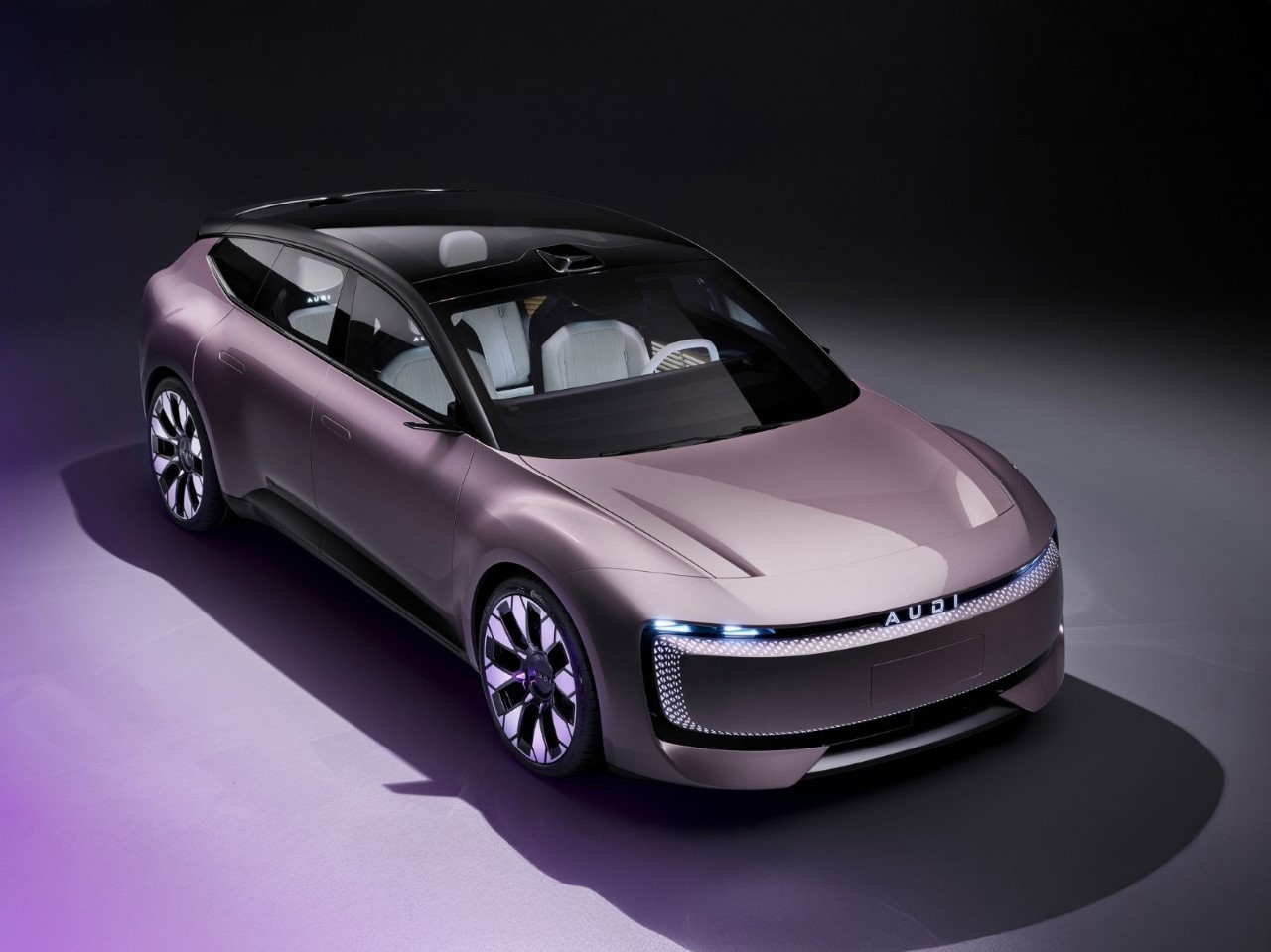
Audi’s logo change in China takes a localized approach, catering to Gen Z and millennial preferences. The iconic four-ring logo was simplified to a sleek design exclusive to the Chinese market for its new EV series. Audi has demonstrated cultural sensitivity by collaborating with local suppliers like CATL and Momenta while maintaining global brand consistency. “Audi’s redesign for China is not just about visuals but about connecting with a demographic that values innovation and relatability,” Khan adds.
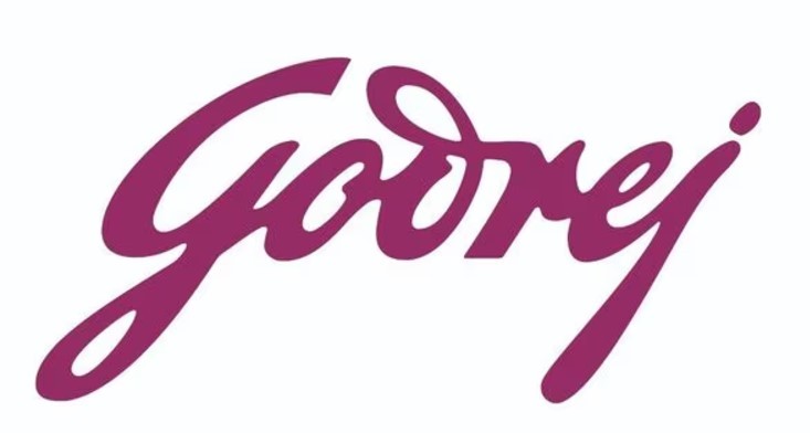
Closer to home, Godrej’s recent logo revamp subtly modernized its iconic script to reflect a forward-looking ethos while maintaining its legacy. The new logo aligns with the brand’s evolving portfolio, targeting younger audiences without alienating its existing customer base.
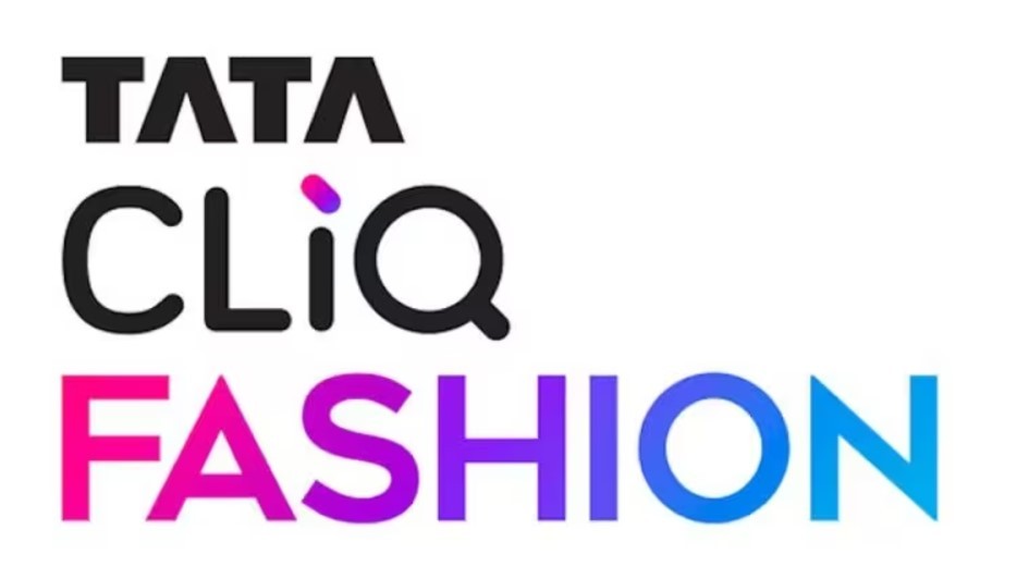
Similarly, Tata Cliq rebranded itself as Tata Cliq Fashion, focusing on fashion and lifestyle, reflecting a sharp shift in brand identity.
This trend of minimalism extends beyond automobiles and FMCG. Pepsi, Bumble, and even Visa have opted for simpler, modernized designs in 2024. These rebrands are not about cost-cutting but about versatility and relatability in the digital age. "Modern logos work seamlessly across platforms, from billboards to mobile screens, ensuring timelessness and relevance," says Khan.
However, rebranding is not without its risks. History has seen examples like GAP’s failed minimalist rebrand, which alienated loyal customers, leading to a swift return to the original design. On the other hand, Airbnb’s shift to a simplified, inclusive logo boosted brand equity, underscoring the potential of a well-strategized redesign.
Statistics show that 60% of brands experience positive outcomes post-rebrand, provided they balance innovation with heritage. Minimalism enhances brand recall, but only if it resonates with the audience's emotional and cultural expectations. As brands continue to embrace this shift.